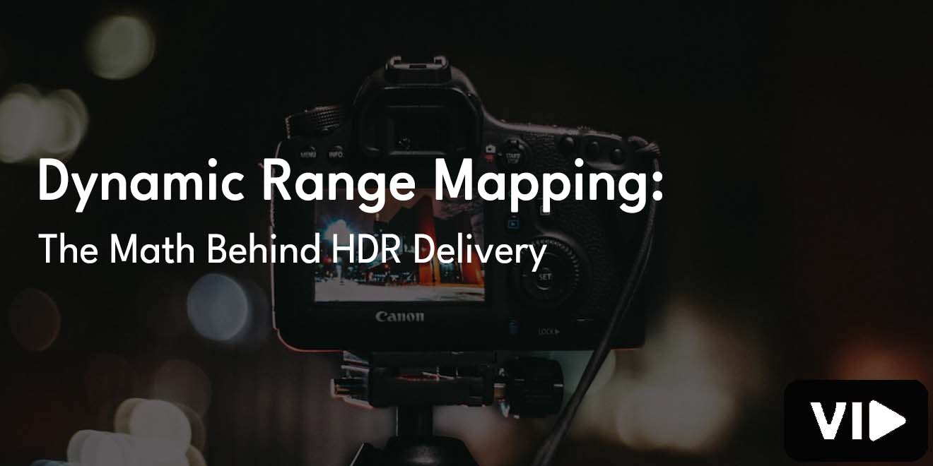
High dynamic range looks magical until you realize the trick is mostly math, taste, and a few sensible guardrails. If your world touches video production and marketing, the way bright skies, glossy car paint, and candlelit faces survive the journey from lens to living room is not a black box. It is a chain of mappable functions, each with a clear purpose. Once you see the links, you can explain choices, predict results, and protect creative intent without crossing your fingers.
What Dynamic Range Really Means
Dynamic range is the span between the darkest and brightest values a system can present while still looking clean. We often measure it in stops, because each stop doubles light and keeps ratios easy to compare. Cameras may capture fourteen stops or more, while an SDR grade anchors white near 100 nits.
HDR masters lift that ceiling to 1,000, 2,000, or even 4,000 nits. Because our eyes respond nonlinearly, a straight linear mapping would waste precision where we notice least and crush detail where we care most. We need curves that mimic perception so code values concentrate in the regions that matter to the viewer.
From Photons To Digits: The Capture Side
A sensor collects photons, turns them into charge, and converts that charge into a digital number with an analog to digital converter. Full well capacity sets the brightest signal, read noise sets the floor, and bit depth defines how many steps you have between them. Twelve to fourteen bits per channel is common on cinema cameras, which preserves subtle changes in exposure and color.
Since perception behaves roughly logarithmically, cameras often apply an opto-electronic transfer function that compresses linear scene light into a friendlier curve. The result saves headroom for highlights, preserves midtone detail, and keeps shadows from breaking into banding during the grade.
Transfer Functions That Shape the Curve
Transfer functions are the glue between scene values and display values. They allocate code values where the eye cares most and let different devices speak a common language. Four families dominate HDR delivery, each with a distinct personality.
Traditional Gamma
Older pipelines use a simple power law, often written as y equals x to the power of one over gamma. With gamma near 2.2, the curve brightens shadows and gently reins in highlights. It works well for SDR, yet it runs out of steam when you need real headroom above 100 nits, so modern HDR relies on other shapes for delivery.
Log Encodings
Log curves, such as LogC or S-Log, aim for perceptual uniformity across many stops. A simplified form looks like a times log base ten of b times x plus one, plus c, with constants that set the pivot and scale. The payoff is efficient bit usage from dark rooms to sunlit windows. You often grade from a log master because it is pliable and then map to the delivery curve once the creative decisions settle.
Perceptual Quantizer
The perceptual quantizer curve defined in SMPTE ST 2084 maps code values to absolute display luminance in nits. Equal code steps aim for equal perceptual steps, which gives repeatability across devices that implement PQ correctly.
PQ underpins HDR10 and Dolby Vision, so a code value has a specific physical meaning once it reaches a compliant display. The practical win is simple. A highlight at 1,000 nits in the suite is intended to feel like 1,000 nits at home, subject to the device being able to reach it.
Hybrid Log Gamma
HLG grew out of broadcast needs where backward compatibility and simplicity matter. It behaves like conventional gamma in the low end and like a log curve in the high end. It is scene-referred, it does not require metadata, and it plays acceptably on many SDR sets by design, though with less absolute control compared with PQ-based masters.
Tone Mapping Versus Dynamic Range Mapping
People swap these terms freely, yet they are not the same. Dynamic range mapping describes the full transformation from scene-referred or working-space values to display-referred output under the chosen standard. Tone mapping focuses on what you do when content exceeds what a display can show.
Picture a sun glint measured at 4,000 nits when your master targets 1,000. A tone mapper compresses that region so detail survives and the highlight still feels bright without smacking into a hard ceiling. Good tone mapping is protective, not punitive. It prefers gentle roll-offs, preserves midtone relationships, and avoids unpleasant shifts in hue.
The Math Of Mapping: A Step by Step Mental Model
A tidy model keeps the process honest. Let S be scene-referred values normalized between zero and one. First, apply the chosen opto-electronic transfer function to produce encoded values E. In a PQ delivery chain, the display applies the electro-optical transfer function to recover a target luminance L in nits.
If L exceeds your mastering peak or the device limit, a compressive function T bends the top of the curve so that the output L_out fits within capabilities while staying faithful to the picture. A simple knee can do the job. One useful form is L_out equals L divided by one plus alpha times the maximum of zero and L minus L_knee. The parameter alpha controls how assertively highlights compress, and L_knee sets where the shoulder begins.
Below the knee the slope stays close to one, which keeps local contrast intact. Above the knee the curve flattens in a controlled way so specular details remain present without creating harsh steps. The exact algebra differs across implementations, yet the goal stays constant. Protect the midtones, curve the brights with grace, and never invite banding where the eye is most sensitive.
Color Volume and Gamut Considerations
Luminance is only half the story. Color spaces define a triangle of primaries, and real displays can realize only part of that color volume as brightness rises. Rec.709 is compact, P3 is larger, and Rec.2020 is the generous HDR container even though few consumer panels reach its edges. When a pixel wants high saturation at high luminance and the display cannot provide both, you have three choices.
Reduce saturation, reduce luminance, or share the burden along a hue-preserving path so memory colors remain believable. Good operators couple chroma and luma. As saturation climbs, a small dip in luminance can preserve the sensation of punch.
Always watch skin, foliage, and sky gradients because the eye knows those regions by heart. Do nonlinear adjustments in a linear or perceptually uniform space, then convert back to your delivery space so hue lines do not wiggle and edges stay clean.
Practical Targets and Tradeoffs
Common targets help you plan. SDR white lives near 100 nits by specification. Many HDR grades adopt 1,000 nits for the mastering peak because it balances sparkle with comfortable average picture levels. Ambitious masters at 2,000 or 4,000 nits can feel spectacular, yet they demand careful protection of midtones so the image does not feel dim overall. Remember that living rooms are not grading suites.
Viewers rarely sit in the dark, which means mids carry the emotional weight. A delightful highlight means little if faces look tired or murky. Noise lurks in shadows and loves to announce itself when you lift the toe.
A gentle toe that hides sensor grain without smothering detail keeps the picture calm. Midtones deserve generous code allocation so skin renders cleanly. Highlights want a shoulder that feels like light, not a sudden clip. If a chart tells you the curve is perfect but a face tells you otherwise, trust the face.
Common Pitfalls and How to Avoid Them
Double mapping breaks pictures fast. If a signal arrives already PQ-encoded and you accidentally apply a second OETF, the image will look wrong before the first shot ends. Track your signal at every handoff and label files clearly so no one adds a mystery transform. Unequal processing per channel also causes trouble, shifting hue in the highlights or the toe. Do nonlinear work in a space that keeps hue stable, then return to the target space.
Calibrate displays, verify bit depth throughout the chain, and keep an eye on black levels so lift does not creep in unnoticed. Average picture level matters. A scene that is mostly bright can appear too dim on some sets if the metadata suggests a conservative target. A mostly dark scene with tiny specular peaks may tempt a TV to chase brightness and wash the mood.
Grade with device behavior in mind, test on a few consumer displays, and let the scopes and your eyes agree instead of arguing like siblings in the back seat. The more predictable your mapping, the more predictable your clients’ living rooms will feel.
Conclusion
Dynamic range mapping is not mystical, it is a set of decisions expressed as curves. Cameras capture a generous span of light, transfer functions compress it sensibly, and tone mappers keep the brightest sparks inside the box without dimming the soul of the picture.
When you understand how those curves behave, you stop guessing and start shaping. The math guards the rails, your taste drives the car, and the audience gets a picture that glows for the right reasons.


%2002232023.jpg)