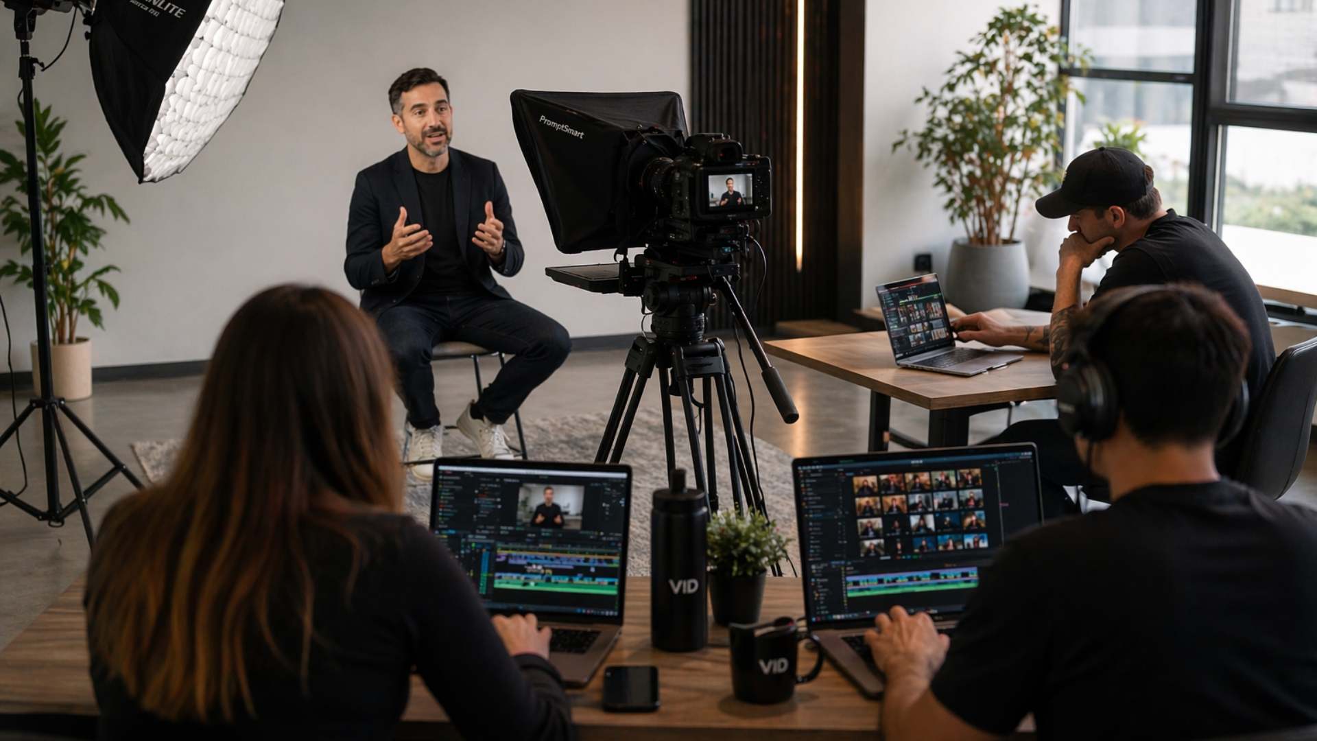
Wardrobe is the production decision that most video creators and marketing teams make last — and the one that viewers register first. Before the presenter has said a single word, the viewer has formed an impression of their credibility, their professionalism, and the brand they represent — based entirely on what they are wearing and how it reads on camera.
The challenge is that what looks good in person and what looks good on camera are not the same thing. Fabrics that look professional in a meeting room produce distracting visual noise on screen. Colors that look strong in natural light wash out under video lighting. Patterns that look subtle in person create a strobing effect that draws the viewer's eye away from the presenter's face and toward the movement on their chest. And styling choices that signal authority in a live interaction can read as stiff, overdressed, or out of context in the specific visual environment of a professional video.
Getting wardrobe right for video is not about having expensive clothes or a professional stylist. It is about understanding the specific ways that the camera interprets fabric, color, and pattern differently from the human eye — and making the specific choices that translate well to screen rather than the choices that look best in the mirror before filming begins.
In this video, Dallin Nead walks through the complete on-camera wardrobe framework — covering every category of wardrobe decision that affects how a presenter reads on camera, the specific choices that work and the specific ones that consistently create problems, and the practical styling system that any creator or marketing team member can apply to every filming session without a wardrobe consultant or a production stylist in the room.
What this video covers:
Why wardrobe matters more than most creators think
The viewer's impression of a presenter's credibility is formed in the first two seconds of the video — before the hook has landed, before the argument has begun, and before the delivery quality has had a chance to establish trust. That first impression is determined primarily by three visual signals: the environment behind the presenter, the lighting on the presenter's face, and what the presenter is wearing.
Of these three, wardrobe is the decision that most creators treat as an afterthought — the choice made in the fifteen minutes before filming begins based on what happens to be clean and available rather than on what will produce the right impression in the specific visual context the video creates. The specific ways that a poor wardrobe choice undermines the credibility that the hook, the content, and the delivery are working to build — and why the two seconds of first impression that wardrobe determines cannot be recovered by anything that happens in the rest of the video.
Colors — the most important wardrobe decision for on-camera video
Color is the wardrobe variable that has the most significant impact on how a presenter reads on camera — and the variable that is most consistently chosen without any consideration of how it will translate to screen.
The colors that consistently perform well on camera are the mid-tones — the blues, greens, burgundies, and earth tones that provide enough contrast against most backgrounds to make the presenter visually distinct without creating the exposure problems that very light or very dark colors produce. Navy blue is the most universally reliable on-camera color — it reads as authoritative and professional across every skin tone, every background color, and every lighting setup without requiring specific lighting adjustments to prevent the color from washing out or blocking up in the video signal.
The colors that consistently create problems on camera — and why each one creates the specific problem it does. Bright white and very light colors cause the camera's exposure system to underexpose the presenter's face in order to prevent the bright clothing from blowing out — producing a shadowy, underlit facial appearance that no lighting setup can fully compensate for. Very dark colors — particularly black — block up in the video signal and lose all fabric detail, making the presenter appear to be floating a disembodied head above a dark void rather than wearing a garment with texture and dimension. Bright saturated colors — particularly red — cause color bleed in video compression that produces an unpleasant visual artifact around the edges of the garment on screen.
The specific color palette recommendations for every skin tone and every background color combination — and the one color test that every creator should run on their specific camera and lighting setup before committing to any color for a major production.
Patterns — the wardrobe decision that most commonly derails an otherwise strong setup
Patterns are the wardrobe decision that most creators get wrong most consistently — because the patterns that look subtle and sophisticated in person translate to distracting visual noise on camera that competes with the presenter's face for the viewer's attention throughout the entire video.
The specific pattern types that create problems on camera and the specific visual artifact each one produces. Fine checks, thin stripes, and small geometric patterns produce a moiré effect — a shimmering, strobing visual interference pattern that appears in the video wherever the pattern's spatial frequency interacts with the camera sensor's pixel grid. The moiré effect is not correctable in post-production and is not visible in the viewfinder or the live preview — it only appears in the recorded footage, which means it is frequently discovered after filming is complete rather than before it begins.
The pattern types that work reliably on camera — and the pattern scale threshold that determines whether a pattern that looks bold in person will produce moiré interference or read cleanly as a textured solid on screen. The specific test for evaluating any patterned garment for camera-readiness before wearing it in a filming session — and the backup wardrobe protocol that eliminates the risk of discovering a pattern problem after the filming session is complete.
Fabrics — how texture and material translate to camera
Fabric choice determines how a garment reads on camera in terms of texture, sheen, and visual weight — and the fabric decisions that look professional in person frequently produce the opposite effect on screen.
Highly reflective fabrics — satin, silk, polyester blends with a sheen finish — catch the video lighting and produce hot spots on the garment that are distracting in the same way that a reflective surface in the background would be. The hot spot moves as the presenter moves, drawing the viewer's eye to the fabric rather than the face. Matte, medium-weight fabrics — cotton, wool blends, linen, structured jersey — absorb light evenly and produce the clean, consistent visual result that on-camera video requires.
The specific fabric recommendations for every filming context — studio production, remote filming from a home or office environment, and outdoor or location production where the lighting conditions cannot be controlled — and the one fabric test that identifies reflectivity problems before they appear in recorded footage.
Fit — why the way a garment fits on camera is different from how it fits in person
Fit is the wardrobe variable that most affects how a presenter's physical presence reads on camera — and the fit considerations that apply to on-camera video are different from the considerations that apply to in-person presentation.
Camera angles compress and flatten the visual impression of the presenter's body — which means garments that fit well and look professional in person can read as ill-fitting, oversized, or shapeless on camera. The specific fit adjustments that improve on-camera appearance for every garment category — structured jackets, shirts and blouses, and knitwear — and the specific fit problems that most commonly undermine an otherwise strong wardrobe choice. The collar and neckline considerations that affect how the presenter's face is framed on screen — and why the neckline decision is the single most important fit consideration for on-camera video regardless of the garment type.
Accessories — what works, what does not, and what to leave out entirely
Accessories are the wardrobe element that most commonly creates audio and visual problems in on-camera video — problems that are discovered during post-production rather than during filming and that cannot be corrected without re-filming.
Jewelry that moves, dangles, or makes contact with a clip-on or lapel microphone produces the most common and most disruptive on-camera audio problem — a persistent rustling, clicking, or tapping sound that is captured by the microphone and appears in the audio track of every take in which the presenter moves. The specific jewelry types that consistently create audio problems and the specific microphone placement configurations that are affected by each. The jewelry choices that work reliably on camera — fixed studs, simple chains worn inside the garment, and structured accessories that do not move during normal presenter movement — and the accessories that should be removed entirely for any filming session where audio quality is a primary requirement.
Glasses are the accessory that creates the most complex on-camera challenge — the lens reflection from video lighting is frequently visible in the recorded footage and produces a bright, distracting glare in the viewer's line of sight to the presenter's eyes. The specific lighting adjustments that minimize lens reflection from glasses on camera, the glasses frame considerations that affect how prominently the reflection appears, and the alternative options for presenters whose vision requirements make filming without glasses impractical.
Building a filming wardrobe — the practical system for every creator and marketing team
The practical solution to the on-camera wardrobe problem is not a wardrobe consultation before every filming session. It is a documented filming wardrobe — a small, curated selection of garments that have been tested on the specific camera setup, in the specific filming environment, and against the specific background the presenter uses — and that are reserved exclusively for filming sessions so the choice is made once rather than remade from the full wardrobe every time a filming session is scheduled.
How to build a filming wardrobe from the existing wardrobe without purchasing anything new — the specific testing process that identifies which existing garments perform well on camera, how to document the results so the best-performing options are always accessible without repeating the testing process, and how to expand the filming wardrobe systematically as the content program grows and the variety of filming contexts increases.
The brand consistency dimension of the filming wardrobe — how to develop a documented visual standard for on-camera appearance that ensures every presenter who appears in the content program reads as part of the same brand rather than as an individual making independent wardrobe choices in each video.
Who this video is for:
Founders, executives, and marketing team members who film on-camera content and want to eliminate the wardrobe decisions that undermine the professional standard the rest of the production is working to achieve.
Content creators at any stage of their video production journey who have experienced the specific wardrobe problems — the moiré effect on a patterned shirt, the blown-out exposure from a white jacket, the microphone noise from a dangling necklace — and who want the specific, practical solutions rather than the generic advice to dress professionally.
And any marketing team that is building an internal video production capability and wants the on-camera wardrobe standard documented as part of the filming standard that every team member follows — so every video in the content library maintains a consistent visual quality standard regardless of which team member is on camera.